Saturday 18 December 2021

Christmas Cards

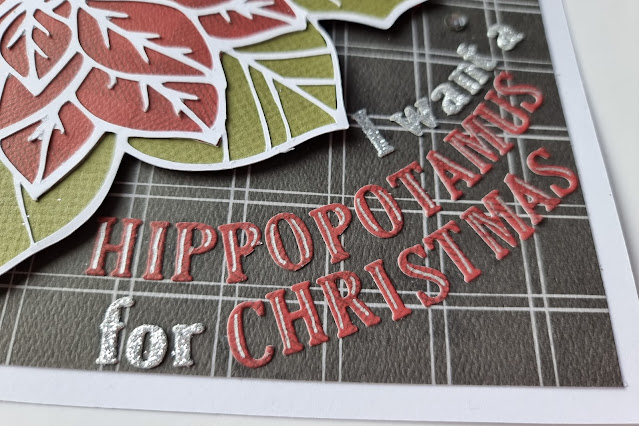
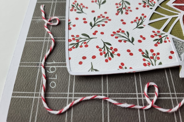
Every year I try and make a few Christmas Cards for some of my crafty friends. 

This years cards were made with Kraft cardstock,white iridescent and emerald green glitter card and twine.

Friday 17 December 2021

Carta Bella Happy Christmas - Ho Ho Ho

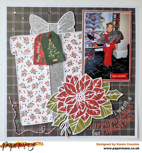
Today I have layout using Carta Bella's Happy Christmas collection on the Papermaze blog. This layout which was inspired by a layout by Suzanna Lee, uses a very simple loose grid design which is great for scrapbooking multiple photos. 

I started by creating my own Ho Ho Ho cut file and cut this from a sheet of white cardstock. The sheet of cardstock was then trimmed down slightly and stuck onto a sheet of red cardstock leaving a narrow border. Using white thread I then machine stitched round the edges.

I created shaker pockets from the Os in the The Ho Ho Ho words using some acetate and silver sequins.  

The words were then stuck back into the apertures using foam squares underneath to raise them slightly and add dimension. They were also slightly offset to give the impression of a shadow.

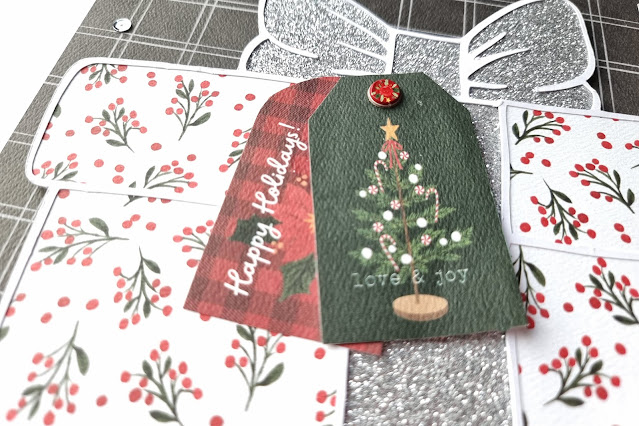
I layered some of the 3x4 journalling cards and Gift Tags behind my three photos, threaded the tags with some red bakers twine and then placed them on the layout with 3D foam underneath.

Various bits and pieces were used to embellish the photos. I used some pieces from the sheet of chipboard phrases and also some wood veneer Christmas Trees. I used some stars punched from silver glitter card too to pick up the silver in the shaker pockets.

Finally I added the date, cut from some of the red paper from the collection, in the top corner.

Friday 3 December 2021

Carta Bella Happy Christmas - I Want a Hippopotamus for Christmas

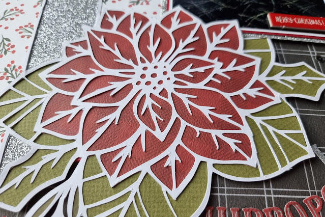
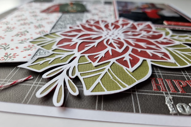
This is first layout using Carta Bella's Happy Christmas collection. This is a traditional Christmas coloured collection and includes images of Christmas trees, poinsettias, wreaths, snowflakes and lots more. It is perfect for scrapbooking Christmas memories and for my layout today I choose to scrapbook a Christmas Day photo from my childhood.


I started by trimming a sheet of the Christmas Wreaths paper down to 11.5" x 11.5" and matted the grey B side onto a sheet of white cardstock.


I found a Christmas present cut file in the Silhouette Store and cut this from smooth white cardstock  then backed it with papers from the collection (B side of Popping Poinsettias and Holiday Hollies), some scraps of green cardstock and some silver glitter card. I chose silver to echo the silver Christmas tree in the photo.

My photo was triple matted with red and white cardstock and silver glitter card. I cut a slit in the backed cut file and slotted my 4x6 behind the poinsettia before attaching the photo and cut file to the centre of the layout with 3D foam underneath.


Without the 3D foam the layout would have been very flat but the foam elevates the elements just enough to give a little bit of dimension.


One of the chipboard phrases was stuck to the bottom of the photo.


A couple of tags cut from the Gift Tags paper were places on the present as well as a chipboard circle from the sheet of chipboard phrases.


I die cut some title lettering from more of the paper and glitter card and arranged the title in an arc in the bottom right corner of the layout.


To give somewhere for the date to sit, I twirled some red and white bakers twine around the bottom left corner and used some very old white rub-ons from my stash to add the date.

Finally I scattered some silver sequins here and there to make the layout even more sparkly.

Saturday 20 November 2021

Carta Bella Welcome Autumn - Let's go for a Walk.

Here's another scrapbook layout using Carta Bella's Welcome Autumn collection. 

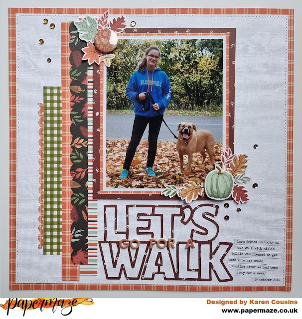
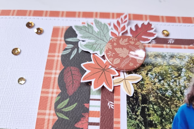
I started with a piece of white Bazzill cardstock which I trimmed down to 11.5" x 11.5", matted onto a sheet of the Crisp Leaves paper and machine stitched round the edge with white thread. The Crisp Leaves paper actually had a huge piece missing from the middle as I had already used some of it on one of my other layouts, and I also wanted to use some elsewhere on this layout. By matting the white cardstock on top of the Crisp Leaves paper you would never know it wasn't a whole sheet.

On the left side of the layout I layered several vertical strips of patterned paper. I used border punches on some of the strips to add a bit of interest.

My photo was then triple matted with white cardstock, some of the Crisp Leaves paper and the B side of the Journalling Cards paper. The matted photo was then added to the layout, overlapping the paper strips, and with some 3D foam underneath to add some dimension.

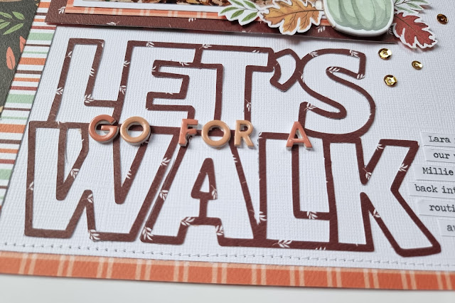
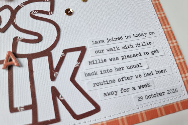
Using a free 'Let's Walk' cutfile from the Hip Kit Club, I cut the title from more of the B side of the Journalling Cards paper. I chose not to back the cut file and  instead left the open parts empty so the title really stood out on the white background. The cut file was placed beneath the photo and completed with the addition of some tiny foam alpha stickers from my stash.


I embellished the layout with a chipboard pumpkin from the Chipboard Accents sheet and some leaves which were fussy cut from the Crisp Leaves paper.

 
I also added a flair badge to the top left of the photo, from my stash.


Journalling strips typed on my computer and printed on white paper were added to the bottom right corner of the layout.


Finally, a few gold sequins were dotted here and there.

Friday 5 November 2021

Carta Bella Welcome Autumn - Leaves are Falling.....

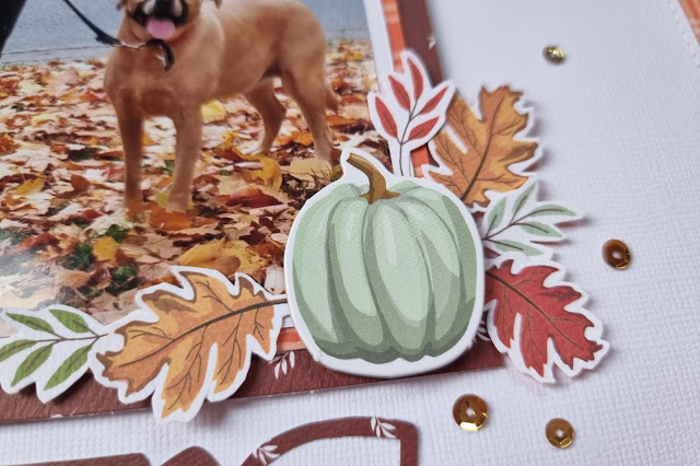
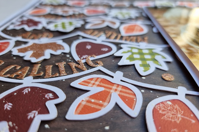
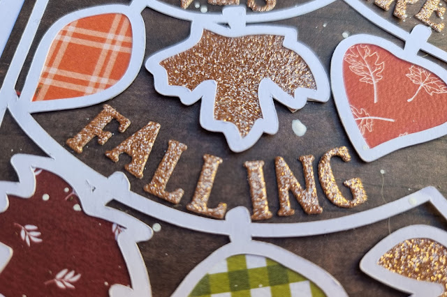
Today I have another layout using the Carta Bella Welcome Autumn collection and a cut file from Paige Evans.

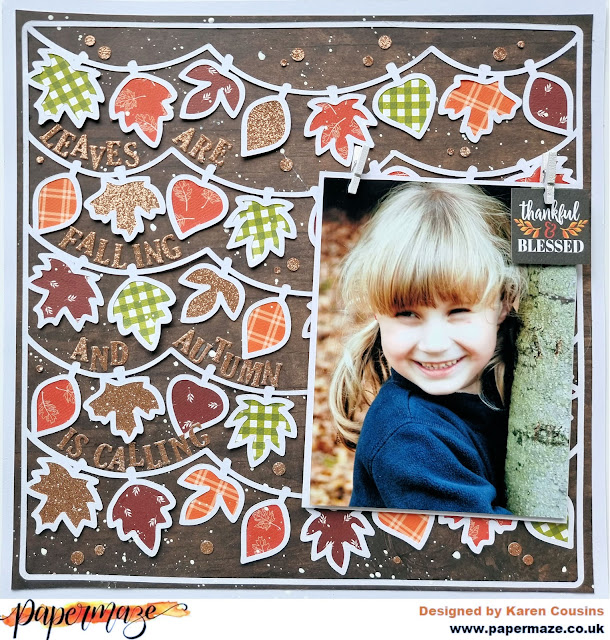
Using my Silhouette I cut the Leaf Banners Background cut file by Paige Evans from a 12x12 sheet of smooth white cardstock and backed the leaves with paper from the collection - Autumn Air, B side of Perfect Pie, B side of the 3x4 Journalling Cards and Crisp Leaves. 


I also backed some of the leaves with some rose gold glitter card that I had left over in my stash from making some cards.


The cut file was then stuck flat on top of a sheet of Simple Stories Sn@p Basics - Walnut/Cream Dot paper. I really love the Welcome Autumn collection but I wished it contained some woodgrain papers. I looooooooooooove woodgrain papers and think they are particularly good for autumnal layouts and the Simple Stories paper was perfect. The dark brown background really made the other colours and my photo pop.


My 5x7 photo was matted on some white cardstock and attached to the right side of the layout with some 3D foam underneath to give it some dimension. To make it look like the photo was hanging from the leaf banner, I added some small wooden pegs to the top of the photo and also tucked an image from the Seasonal Squares paper under one of the pegs.


Letters die cut from more of the glitter card were added along the banners for my long title.


I wanted to add some sequins to the layout (for extra sparkle) but unfortunately I didn't have any in the right colour, so I used a couple of hole punches to punch some dots from the glitter card and added these to the layout instead. Finally, watered down white acrylic paint was splattered over the layout.

Wednesday 20 October 2021

Carta Bella Welcome Autumn - My Favourite Colour is October

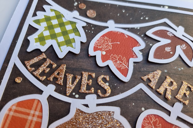
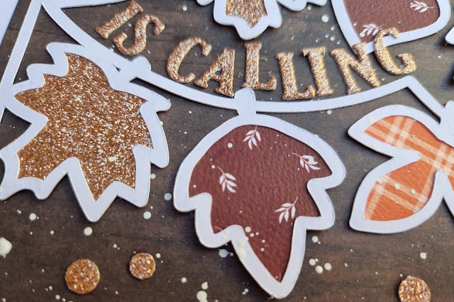
Today I have a layout to share using the Welcome Autumn collection from Carta Bella. As the name of the collection suggests, this collection is autumn themed and the colours are traditional vibrant autumn colours - oranges, reds, rusts, browns and greens  This is the first layout I've created using this collection and the colours were the inspiration for my layout which uses a large 12" x 8" photo taken in October a few years ago.

I used one of my go-to designs for this layout - a big photo and borders top and bottom.

I used a piece of 12x12 white cardstock for my base and stuck my photo about 2" from the bottom of the layout.

Above and below the photo I added strips of the Perfect Pie (B Side) and Autumn Air (B Side) papers. I added some gold and black washi tape from my stash and a punched white cardstock border strip. I also machine stitched with white thread across one of the strips at the top.


The title at the top of the page was created using white foam alphas from Pink Paislee and the word October was cut on the silhouette from white cardstock. I nestled the word October among the foam alphas and let it overlap the top of the photo.

At the bottom of the page I added two tags made from the 3x4 cut apart journalling cards. Foam was placed underneath the tags to raise them up slightly and they were finished off with eyelets and bakers twine.


I tucked a few chipboard leaves and a pumpkin from the Chipboard Accents sheet underneath the tags and also dotted some gold sequins along the bottom.

The layout was completed with the addition of some teeny tiny black letter stickers for the journalling

Wednesday 6 October 2021

49 & Market Vintage Artistry Hike More - A Moment in Time

Today I have a final layout on the Papermaze blog using the 49 & Market Vintage Artistry Hike More collection. My two previous layouts have been nature themed but today's layout is a heritage style layout  using a photograph of my nana when she was a young woman.

I started with a sheet of olive green cardstock. I trimmed a quarter of an inch from each side of a sheet of the Bramble paper and then using a distressing tool I distressed the edges of the paper. The paper was  machine stitched on top of the olive cardstock with white thread. After stitching the paper I used my fingernails to lift the edges of the paper to give the background some more texture and dimension. 


I also machine stitched round the edges of my photo and a butterfly card from the pack of Ephemera Bits with the same white thread. Then, using a craft knife, I cut round the wings of each butterfly on the card and slipped my photograph underneath the wings before attaching the card and photograph to the the centre of the layout with some craft foam underneath.

3D foam squares were also placed underneath the butterfly's wings to keep them raised up.

The layout was embellished by tucking lots of  bits and pieces under the card and photograph. 

Using a honeycomb die I cut some pieces from kraft cardstock to add to the layout. 


A doilie and die cut leaf-flourish were added.


A kraft tag tied with natural twine was tucked behind the top of the photo.


At the bottom of the photo I added some cream cotton lace and a vintage button from my button tin.


Letters cut from more of the olive cardstock were used to create the title and the date and a few sequins finished off the layout.

Monday 20 September 2021

49 & Market Vintage Artistry Hike More - Sometimes Nature is all you Need

I have another layout using the 49 & Market Vintage Artistry Hike More collection. I'm still loving this collection and for today's layout I've used some nature photos taken whilst on holiday in Norfolk.


For my background I used a sheet of the Boscage paper. I trimmed 5mm from each side and matted this onto a sheet of Bazzill Kraft cardstock to give a very narrow border to the layout. Using my sewing machine I stitched all the way round the edge using white thread.

My eight  2" square photos were double matted on white and kraft cardstock and attached to the layout with 3D foam underneath. I only put foam underneath the top and bottom edges of the left side of the photos because I knew I wanted to tuck a journalling card behind the photos and by omitting the foam in the middle it made it easy for the card to slip in and out.


Using my computer I printed my journalling onto one of the journalling cards from the cut apart sheet. I downloaded a mushroom dingbat from dafont.com so I was able to add some mushroom images to my journalling. The left side of the card was punched using a notebook border punch from EK Success and the finished card was tucked behind the photos.


In the centre of the photos I added a word strip from the pack of Ephemera Bits and used 3D foam underneath for dimension.  


I created three embellishment clusters on the layout using more of the Ephemera Bits, Chipboard Stickers, Washi Tape and Epoxy Stickers as well as lace, wood buttons and twine from my stash. I tried to include all the colours from the collection in each of the clusters.


By rubbing some of the rub-ons onto some patterned paper and then fussy cutting the images out I was able to create some extra die cuts, for example some of the butterflies. 


On this layout I used a lot of 3D foam underneath the elements to give the clusters lots of dimension.


Finally I splatted some Distress Oxide Ink in Peeled Paint onto the layout. 

Monday 6 September 2021

49 & Market Vintage Artistry Hike More - Take the Path Less Travelled

Hello, Karen here today with my first layout using the beautiful Vintage Artistry Hike More collection from 49 & Market. The quality of the papers from 49 & Market are exceptional and no photos online can do the printed designs justice. They are gorgeous! The Hike More collection is perfect for scrapbooking outdoorsy photos, nature photos, woodland photos and so much more. The colours in the collection would be ideal for spring, summer or autumn photos.

For the layout I'm sharing today I'm using photos taken during a trip to Anglesey in Wales.

I started by tearing round the edges of a sheet of the In the Thicket paper. I then roughed up the torn edges and attached the paper to the B side of a sheet of the Boscage paper. (Did you know that 'Boscage' is a mass of trees or shrubs? No? Me neither. Thank you Google 😁).


I sanded the edges of  three 4x6 photos, matted these onto some vellum, added a couple of cards from the pack of the Ephemera Bits behind two of the photos and stuck these to the layout.


Using the computer I also typed the date and place name onto one of the cards before attaching it to the layout.


A die cut View Master reel from the pack of the Ephemera Bits was tucked underneath the photos and was the grounding for one of my three clusters of embelishments.


chipboard frame was used to draw attention to my daughter in one of the photos and various flowers and leaves from my stash were added.


Some of the epoxy bubble stickers from the pack of Wishing Bubbles and Trinkets were used as flower centres.


I also created some tendrils to add to the clusters by wrapping some green wire (stalks cut from some paper flowers) round a fine knitting needle. The flowers, etc were all held in place with some liquid adhesive.


Finally, I added some of the rub ons to the layout. I wanted to colour one of the rub ons. I wasn't sure how the watercolour paint I used would take to the slick surface of the rub ons but whilst it did pool a little, it dried fairly quickly and the pooling was OK as the collection has a distressed look  anyway.

The rub-ons went onto the paper so easily - like butter and its hard to tell which images on the paper are printed and which are rub-ons.