Friday, 22 December 2023

Vicki Boutin Peppermint Kisses - Have Yourself a Merry Little Christmas

This is my final layout using Vicki Boutin's Peppermint Kisses collection which is also my final layout for 2023.

I've been working with the 12x12 paper pad this month and started my layout by layering the red candy cane striped paper and text paper onto a sheet of white 12x12 cardstock with another layer of white cardstock between.

With white thread I machine stitched a straight stitch round the edges of the papers. This is quite a flat layout, so the stitching added some texture. Before adding any elements, I also splattered some gold ink onto the background

Using some of the green papers from the collection I cut four simple triangular Christmas Tree shapes and punched some holes in a couple of them. After machine stitching round the edges of the trees, the trees were glued to the centre of the layout in a row.

I die cut some stars from gold card and added one to the top of each tree.

A piece of gold ribbon (from a recent gift) was stuck horizontally across the bottom of the layout. Three small photos, from Christmases past, were matted with more of the red striped paper and placed at the bottom of the trees.


To create a title I took the phrase 'Merry Christmas' from a sheet of Mintay Papers Chippies Christmas Words and cut it in half. Using embossing powder I transformed the bare chipboard into gold and added the two words to the layout.

The other words in the title were made by die cutting letters from gold card which I backed with some self-adhesive foam. 

At the top of the layout I placed a phrase from the pack of Journaling Ephemera and also added some phrase strips from my stash. 

The layout was finished with a scattering of gold sequins to add some Christmassy sparkle.

Monday, 11 December 2023

Vicki Boutin Peppermint Kisses - 'Twas the Night Before Christmas

As we are getting closer to Christmas I have been playing with Vicki Boutin's Peppermint Kisses collection form American Crafts. 


I started by layering a trimmed down a sheet of the Winter Magic paper onto a sheet of the 
Sweet Holiday Wishes paper leaving a narrow border round the edges. I made sure to gut the pink paper before attaching the teal paper so that I had paper left to mat my photos.


Using a cut file from Peartree Cutfiles I cut my title from smooth white cardstock and attached this to the top half of the layout. 

I thought of backing the cut file or even creating a shaker pocket from it, but in the end decided instead to simply embellish it with sequins. I took some white, blue and pink sequins, which matched the colours in the paper, and glued a few inside each letter of the title. I like the sparkle the sequins add to the layout.

I then took four small photos and matted these with the remaining Sweet Holiday Wishes paper. Two of the matted photos were placed at the top of the layout either side of the title with 3D foam underneath, and two photos were attached to the front of a couple of tags cut from the sheet of tags. The tags were placed at the bottom of the layout with more 3D foam beneath.

Through the holes in the tags I threaded a piece of white twine.

Underneath the tags I placed a couple of die cut phrase strips from the pack of Journaling Ephemera. 

At the top of the page I added another die cut phrase strip to one of the photos and some Puffy Phrase Stickers.


To add more texture to the layout I took some silver embroidery floss and stitched onto the Christmas Tree images at the bottom of the page. I used a simple back stitch on one of the trees .....

.... and chain stitch on the other. More sequins were used to embellish the trees as well as some enamel dots.

Finally I printed some journalling strips on the computer and placed these in the bottom right corner of the layout and dotted some more white sequins around the layout.

Monday, 27 November 2023

Carta Bella Fall Fun - Beautiful

This is my final autumn themed layout using Carta Bella's Fall Fun collection. As this is the last layout created from my design team kit, I didn't have any full sheet of patterned paper left so the layout is made from the paper scraps leftover as well as brown and white cardstock and some gold cardstock from my stash.

I started by gutting a 11" square from a 12x12 sheet of brown Bazzill cardstock and set it aside. On top of the remaining brown cardstock I layered a sheet of smooth white cardstock which I trimmed down slightly to leave a narrow border of brown round the edges.

I them added some yellow ink in the middle of the white cardstock using a blending tool. I have to admit it wasn't very evenly blended but as most of it ended up covered it didn't need to be too neat.

With the Loose Leaf free cut file from The Cut Shoppe cut from the remaining brown cardstock, I used scraps of the collection  and some textured gold cardstock to back the leaves.

I made one of the leaves on the cut file into a shaker pocket using sequins from Picket Fence Studios.


With some 3D foam underneath I attached the backed cut file to the centre of the layout.


My photo was printed with a white border and matted with more of the Autumn Abundance paper and stuck it on top of the cut file. A word from the sheet of chipboard phrases was added to the corner of the photo.


I had some gold die cut leaves left over from my previous layout so decided to add these to the rows of leaves too. They added some extra dimension and interest.


In my stash I found the word Beautiful on a sheet of puffy stickers from Paige Evans. It was rather too pink for the layout and I was surprised that despite it having a shiny texture I was able to easily change the colour of it with a swipe or two of brown ink. The word was stuck to the bottom of the layout.


Using small foam letter stickers I added my dog's name beside one of the leaves.


Finally I splattered a little watered down brown acrylic paint onto the layout, added some orange enamel dots and gold sequins and using a brown gel pen I drew a line all round the layout.

Wednesday, 15 November 2023

Carta Bella Fall Fun - Crisp Leaves and Autumn Memories

Today  I have another Autumnal layout using Fall Fun from Carta Bella. I'm really enjoying using this collection which perfectly matched the colours in some photos I had taken during a woodland walk last year.

This layout started out as a scraplift of this layout which I created for the blog in 2019 and whilst the finished layout bears some similarities, it is also quite different. I find that if I am stuck for inspiration, scraplifting a layout (my own or by another scrapbooker) can get the creative juices flowing.

I started my layout by trimming down a sheet of the Freshly Fallen paper by roughly 5mm on each edge,  layered this onto a sheet of mustard coloured Bazzill cardstock and then machine stitched with white thread around all the edges.

Pieces of the Flannel Warmth and B side of the 3x4 Journalling Cards cut apart sheet were then attached to the layout with one piece made into a pocket so that a journaling tag made from more of the mustard coloured card could be slipped into it.


Two photos, one portrait and one landscape, were printed with white borders and matted with the Freshly Fallen and Autumn Abundance papers and mustard cardstock. The photos were placed on the layout with the main portrait photo mounted on 3D foam to raise it up and make it more prominent.


The words from one of the 6x4 Journaling cards were used as a title placed next to the photos with 3D foam underneath. As the word 'Crisp Leaves' in the title were blue I felt that the layout needed some other blue elements so I threaded the tag with blue bakers twine and also tucked some pieces of the B side of the Pumpkin Spice paper underneath some of the paper layers. I think this made the blue in the title look more intentional.


Using some textured gold card from my stash I die cut several leaves on the Silhouette Cameo. Using a scoring tool I scored some veins into the leaves and bent then in the middle to give them some dimension.


The leaves were scattered across the layout from top left to bottom right to give an impression of falling leaves.


Finally I added a journalling strip printed on the computer underneath one of the photos and dotted a few copper coloured sequins here and there.

Friday, 27 October 2023

Carta Bella Fall Fun - 'tis the Season for Giving Thanks

It is certainly feeling very autumnal here and as I like to scrap with the seasons, I was really pleased when Vanessa at Papermaze sent me some of the new Fall Fun collection from Carta Bella to play with. 


This collection uses a colour palette which fans of Carta Bella will be familiar with and features images of pumpkins, leaves, sunflowers, plaids, wreaths and lots more. As the colour palette is an old favourite for Carta Bella, you can also easily easily mix and match old and new Carta Bella collections. My layout uses a harvest photo taken at a National Trust property.


I started this layout by spraying some Mango Blaze Cosmic Shimmer mist onto a sheet of smooth white cardstock. The mist contains mica so has a lovely shimmer. Once the mist had dried, 5mm was trimmed from each edge of the cardstock and layered onto a gutted sheet of the Flannel Warmth paper leaving a narrow frame around the outside. The mist did warp the cardstock a little but once the layout is in album I don't think it will be noticeable. Using brown thread I machine stitched round the edges of the white cardstock.


In the Silhouette Store I found an autumnal wreath cut file and cut this from some dark brown cardstock. The cut file was then backed with papers from the collection and some scraps of cardstock.

The backed cut file was placed in the centre of the layout and the 5x7 photo which had been matted with dark brown card was added.


On the sheet of Chipboard Phrases I found an appropriate plaque and placed this beneath the photo.


In my stash I found some extremely old paper sunflowers and paper leaves and added these to the cut file.


Finally I added a journalling strip printed on the computer at the bottom of the page and dotted some enamel dots and some sequins from Picket Fence around the layout.

Friday, 13 October 2023

P13 - Coffee Break - Coffee & Cake

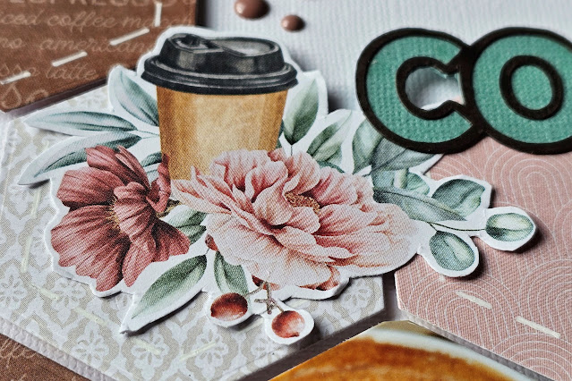
Here is my final layout to share using the Coffee Break collection from P13. My layout today uses always popular hexagons, including three hexagonal shaped photos.


I started by trimming 1/4" from all sides of a sheet of white Bazzill 12x12 cardstock and matted this onto a 12x12 sheet of brown cardstock leaving a narrow brown frame.


From the Coffee Break Patterned papers I cut 14 hexagons and using a white gel pen I drew some faux stitching on the edges. I also cut three photos into hexagons of the same size.


The hexagons were then arranged on the layout and once I was happy with the distribution of colours and the positioning of the photos, they were stuck to the layout with 3D foam underneath to raise them up and create some dimension.


Using a honeycomb die, I die cut some pieces from green cardstock to use as embelishments. The green honeycombs were tucked underneath the hexagons on two sides of the layout. 


From paper #7 and from the bonus pages in the front and back of the 6x6 paper pad, I fussy cut some florals and pastries and used these to create three clusters of embelishments on top of the hexagons.


The green cardstock I had already used on the layout picked up on the green in the floral images.


Using black cardstock I die cut, using the Silhouette Cameo, the title and backed this using more of the green cardstock and some of the patterned paper.


At the bottom of the layout I added a journalling strip printed on the computer.


Finally, I splattered the layout with some brown watercolour paint and scattered some gold sequins and brown enamel dots here and there.

Wednesday, 27 September 2023

P13 - Coffee Break - Probably the Best Coffee Ever

Today I have another layout using P13's Coffee Break collection.

For today's layout, I used eight images taken from WhatsApp messages which I printed onto photo paper.


I started by trimming 1/4" from all sides of a sheet of smooth white 12x12 cardstock and matted this onto a 12x12 sheet of brown cardstock. 


On the right side of the layout I layered various pieces of paper from the 6x6 paper pad and some of the brown cardstock, which I punched with a border punch to create a decorative edge. Later I was able to cover the joins in the 6" pieces of paper with my photo block giving the impression that the papers were a full 12" in length. Using the sewing machine I stitched a straight stitch along the edges.


My eight photos were matted as a block onto a couple of piece of brown paper from the paper pad. 


Images were fussy cut from a 12x12 sheet of paper #3 and added to the layout.


In my stash I found a wood veneer banner with the word 'Fav' cut into it and added this below the photo block.


Using the Silhouette Cameo I cut the title from some dark brown cardstock. The title was stuck in the bottom left corner of the layout nestling the smaller letters among the word Coffee.


Journalling strips were printed with brown ink onto white cardstock on the computer and placed above the title.

Finally I splattered some brown watercolour paint onto the layout and scattered some gold sequins and brown enamel dots here and there.